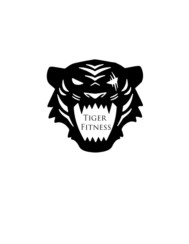
Hey guys so here’s the follow up to the logo sketch post. For this project I decided to create a logo for a fitness company. I chose a tiger to represent my logo because they are fierce animals and I thought this would make for a great logo since the fierceness of tigers sort of embodies the mentality needed for fitness. The principles that influenced me the most was the idea of simplicity. I really wanted to make a simple logo that could be put on things such as merchandise or be made into stickers. The significant element in my design is the use of positive and negative spaces, the white space representing positive space and the black space representing negative space. I really liked this element because it really enforced my goal of simplicity. Coming up with and sketching the logo was probably the hardest part of this design process. At first I could not think of any logo that would make a great fitness company logo, then I thought about the things I would like to have on merchandise such as hoodies and tigers came to mind. After deciding on a tiger I sketched and came up with the logo you see now. The adobe process of creating this logo was fairly simple. I simply took the sketch of the logo I made and imported to adobe illustrator and used the trace tool. A technical issue I came up with during this process was when I used the trace tool and it converted my sketch into a vector, however due to the lighting the full logo would properly be converted. In order to fix this, I imported my sketch into adobe Photoshop and turned the saturation all the way down while changing the levels of the brightness down and the intensity of the shadows up. After doing this and importing my sketch back to illustrator, the trace tool was able to fully convert my sketch into a vector.
Hello Brandon, I really like your logo. The tiger head is clearly a tiger head and looks great. This could be a finalized logo so it is hard to come up with altercations to make. I like the font and size of your text, it is easily readable and well placed. The black and white looks good and it is a simple solid logo. One thing you could consider doing is playing around with color and gradients. You could change the white to a yellow and orange gradient and make it more of a complex tiger look. Another thing you could play around with to see if you like is moving the text. You could put it under the tigers face or one word above and one word under and see if you like that better. These things all come down to personal aesthetic taste and like I said I think you have a very strong logo that doesn’t necessarily need any altercations.
LikeLike
Hi Brandon,
I think your logo is incredible! I think its obvious you put a lot of thought into the idea. I liked your symbolism describing how the tiger describes the mentality needed for fitness. You did a really good job on creating the shape of the tiger head and the placement of the shadow-like spaces. I don’t have very many critiques or recommendations besides maybe adding a little bit of color somehow. Maybe even just a stroke on the letters inside of the tigers mouth. Also, in your draft you had sword like things behind the head in the shape of an x, and I think you should continue with that idea and try to add it in for the final.
Ashley
LikeLike
After reviewing my peer’s feedback, the most common suggestion I got was to play around with color. For my final logo I will try adding color and gradients to make my logo more vibrant. I may also try playing with the wording in my logo. I could try putting the tiger fitness under the tiger rather than in his mouth. Lastly, I got suggestions to add the katanas from my sketch in the final. I previously decided that it was too much to have in one logo and wanted a more simple logo.
LikeLike
I am super impressed with this logo! It is very precise and you can tell you put a lot of time into it. The lines are super crisp and its very symmetrical. It looks like a professional logo. This is the type of logo that will catch someone’s eye as soon as they look at it. The right eye having the two lines through it also adds to the logo overall, even though it seems like such a small detail I noticed it right away. I would say if you made the font bolder it would not only match the thick lines you already have but it would make it pop more. Another idea would be adding color to the font even if it is a subtle color. That would catch the eye right away in the middle of the thick black lines having that bit of color. Overall, it is an awesome logo!
LikeLike